Introduction
SableUI is a high-performance C++ UI framework that brings React's component model and Tailwind's styling approach to native applications - without the overhead of web technologies.
class Counter : public SableUI::BaseComponent {
    void Layout() override {
        Div(bg(245, 245, 245) p(30) centerXY rounded(10)) {
            Text(SableString::Format("Count: %d", count),
                fontSize(28) mb(20) textColour(20, 20, 20));

            Div(onClick([=]() { setCount(count + 1); })) {
                Text("Increment");
            }
        }
    }
private:
    useState(count, setCount, int, 0);
};


What is SableUI?
The driving force behind SableUI is to solve a problem with modern UI development. When building an application, web technologies are often preferable, but they come with heavy performance costs and annoying abstraction layers. SableUI brings modern UI development to a lower level with zero runtime overhead.
Core Philosophy
Traditional C++ UI frameworks require verbose code that's often hard to read. Web frameworks like react solved this with declarative components, but at the cost of performance and introduces an abstraction layer between UI and application logic. SableUI attempts to bridge this gap.
Traditional C++ Pseudo-code
auto* button = new Button();
button->setText("Click me");
button->setPosition(10, 10);
button->onClick([&]() { count++; updateLabel(); });
layout->addWidget(button);
// OR
ElementInfo info{};
info.label = "Click me";
info.position = vec2(10, 10);
info.onClick = [&]() { count++; updateLabel(); };
AddButton(info);
These solutions are not reactive, meaning manual re-renders will have to be scripted to update the labels, and with more complex heirachies it becomes impossible to manage.
SableUI:
Div(onClick([this]() { setCount(count + 1); })) {
    Text("Click me");
}
Concise and reactive (comparable to react), setCount() marks the element as dirty, and will be automatically rerendered next frame.
Key Features
React-Inspired components
Components describe what should be rendered, not requireing definitions on how to update existing UI. State changes trigger automatic efficient rerenders through reconcilliation with a virtual DOM.
class TodoList : public SableUI::BaseComponent {
    void Layout() override {
        for (const auto& todo : todos) {
            Div(bg(45, 45, 45) p(10) mb(5)) {
                Text(todo.text);
            }
        }
    }
private:
    // When "todos" changes via "setTodos()", this component will be automatically re-rendered
    useState(todos, setTodos, std::vector<Todo>, {});
    /* ^^ This syntax is equivilant to reacts:
     * const [todos, setTodos] = useState<std::vector<Todo>>({});
     * but due to limitations within c++, useState is a macro that defines
     * member variables and setters to the component */
};
Learn more about components here and useState() and reactivity here.
Tailwind-Inspired Styling
Chainable modifiers make styling fact and readable, macros ensure expand in the pre-processor, ensuring no runtime-performance loss
Div(
    w(200) h(100)        // Fixed width and height
    bg(45, 45, 45)       // Background colour
    p(10) m(5)           // Padding & margin
    rounded(8)           // Border radius
    centerXY             // Center content on both axis
)
Flexibile Panel System
Declare layouts directly in source per-window that the user can or cannot modify with resizable splitters, inspired by foobar2000's ColumnsUI plugin.
HSplitter() {
    Panel("Sidebar");
    VSplitter() {
        Panel("Editor");
        Panel("Console");
    }
}
Advanced Text Rendering
Full Unicode support including CJK and greyscale emojis, multiple font styles, LCD subpixel rendering, and cached glyph atlases for performance.
TextU32(U"Hello 世界",
    fontSize(16)
    textColour(255, 255, 255)
    justify_center);
Current Status
SableUI is approaching v1.0. and the core features are stable, but no limited component library as of current so use cases are slim
When v1.0. is done, the following features will be fully implmented:
- Vulkan/Metal backends
- Tested linux & macOS support
- Component library (scrollviews, input fields, tab stacks, sliders, etc)
- Expanded documentation
- Shader transpilation across multiple graphics backends
Platform Support
...
Graphics Backends
- OpenGL 3.3+: 98% (small bug)
- Vulkan and Metal: coming soon
Next steps:
Getting Started
Get SableUI runnning in under 5 minutes.
Building from source
NOTE: Building from source is required until v1.0 release
Prerequisites
- C++20 compiler
- CMake 3.15+
- Git
Vulkan SDK
Platform-specific requirements:
- Linux: - Development libraries for OpenGL
- macOS Xcode Command Line Tools
Installation
Add to Existing CMake Project
Git Submodules only works if
your-projectis initialised with git, if not, you can rungit initbefore continuing or go with option 2. Add SableUI as a submodule to your project:
cd your-project
git submodule add https://github.com/oliwilliams1/SableUI vendor/SableUI
git submodule update --init --recursive
Update your CMakeLists.txt:
# Add SableUI
add_subdirectory(vendor/SableUI)

# Link to your executable
add_executable(MyApp main.cpp)
target_link_libraries(MyApp PRIVATE SableUI)
Example CMakeLists.txt:
cmake_minimum_required(VERSION 3.15)

project(MyApp)

set(CMAKE_CXX_STANDARD 20)
set(CMAKE_CXX_STANDARD_REQUIRED True)

# Add SableUI
add_subdirectory(vendor/SableUI)

add_executable(MyApp main.cpp)
target_link_libraries(MyApp PRIVATE SableUI)
Having Issues? Check troubleshooting
Now you have configured SableUI, you can now create your first application!
Your First Application
Create main.cpp:
#include <SableUI/SableUI.h>
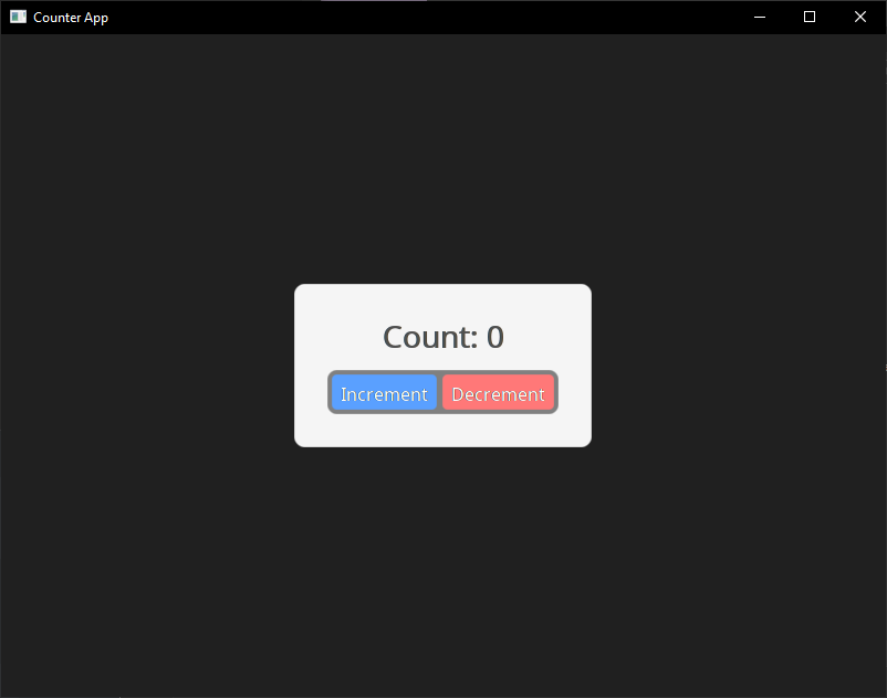
class Counter : public SableUI::BaseComponent {
public:
void Layout() override {
Div(bg(245, 245, 245) p(30) centerXY w_fit h_fit rounded(10)) {
Text(SableString::Format("Count: %d", count),
fontSize(28) mb(20) textColour(20, 20, 20) justify_center);
Div(left_right p(4) centerX rounded(9)) {
Div(bg(90, 160, 255) p(8) mr(5) rounded(5)
onClick([this]() { setCount(count + 1); })) {
Text("Increment",
textColour(255, 255, 255) fontSize(16) justify_center);
}
Div(bg(255, 120, 120) p(8) rounded(5)
onClick([this]() { setCount(count - 1); })) {
Text("Decrement",
textColour(255, 255, 255) fontSize(16) justify_center);
}
}
}
}
private:
useState(count, setCount, int, 0);
};
int main(int argc, char** argv) {
// Register your component
SableUI::RegisterComponent<Counter>("Counter");
// Initialize window
SableUI::Window* window = SableUI::Initialise("Counter App", 800, 600);
// Create layout
Panel("Counter");
// Main loop
while (SableUI::PollEvents())
SableUI::Render();
SableUI::Shutdown();
return 0;
}
First build
Windows:
mkdir build
cd build
cmake ..
Open MyApp.sln in Visual Studio, set MyApp or your project as startup, and build.
OR open CMakeLists.txt in Visual Studio and everything should configure by itself.
Linux/macOS:
mkdir build && cd build
cmake ..
make -j$(nproc)
Building and running your application you should now see the following on your screen:
 Having Issues? Check troubleshooting
Understanding the Code
1. Component Definition
class Counter : public SableUI::BaseComponent {
    void Layout() override { /* ... */ }
};
Components inherit from BaseComponent and override Layout() to describe their UI.
2. State Management
useState(count, setCount, int, 0);
This declares a reactive state, calling setCount() modifies count and triggers a re-render.
NOTE: This is simmilar to react's
useState, synonymous with:const [count, setCount] = useState<int>(0)
3. Declarative UI
Div(bg(245, 245, 245) p(30)) {
    Text("Hello");
}
The use of macros (div(...)) and RAII ensure elements are properly opened and closed.
4. Event Handling
onClick([this]() { setCount(count + 1); })
Lambda callbacks capture state and trigger updates.
5. Registration & Initialisation
SableUI::RegisterComponent<Counter>("Counter");
SableUI::Window* window = SableUI::Initialise("App", 800, 600);
Register component types by name, then initiliase your first window.
6. Panel Layout
Panel("Counter");
Attach registed components to panels, the scope for panel layout is created after window initialisation.
Next Steps
By here, you now have a working SableUI application, you can either get a better understanding on the specifics of certain areas above, or go to the following pages.
Troubleshooting
Build fails with "cannot find OpenGL" or simmilar (Linux)
sudo apt-get install libgl1-mesa-dev libglu1-mesa-dev
^^ Or replace with your package manager
There may be additional libraries, if so this page will be updated later
CMake can't find dependencies Check that you cloned with the --recursive flag. If not:
git submodule update --init --recursive
For more undocumented issues, you can open an issue.
Now you have configured SableUI, you can now create your first application!
Styling Guide
SableUI uses a Tailwind-inspired styling system with chainable modifers. Styles are applied inline where elements are delcared, eliminating the need for verbose styling or seperate stylesheet files.
Philosophy
Traditional UI frameowkrs seperate structure and style, but SableUI brings styles directly to your component definition, just like the powerful tailwind + react stack, without the overhead.
Example:
Div(bg(90, 160, 255) p(12) rounded(8) w(120)) {
    Text("Click me", textColour(255, 255, 255) fontSize(16));
}
Core Concepts
Modifiers (like w(200)) return references to a hidden ElementInfo object, allowing chaining in any order:
Div(w(200) h(100) bg(45, 45, 45) p(10) m(5) rounded(8))
Each modifies is a macro that calls a setter method:
w(200)→.setWidth(200)bg(45, 45, 45)→.setBgColour(Colour(45, 45, 45))
You can find a list of the modifers and definitions in SableUI/SableUI.h or in this table here.
Spacing Units
All spacing values are in pixels. There are no relative units (%) currently and isn't planned anytime soon.
Div(w(300) h(200)) // 300px wide, 200px tall
Layout Properties
Width & Height
// Fixed dimensions
Div(w(200) h(100))

// Fill available space (shared evenly across other 'fill' siblings)
Div(w_fill h_fill)

// Fit content (default for most elements)
Div(w_fit h_fit)

// Constraints
Div(minW(100) maxW(500) minH(50) maxH(300))
Width/Height Types:
w(value)/h(value)- Fixed size in pixelsw_fill/h_fill- Fill available spacew_fit/h_fit- Fit to content sizeminW/maxW/minH/maxH- Size constrains in pixels
Example:
Div(w_fill h_fit minH(200) maxH(600)) {
    // Takes full width, height fits content
    // but constrained between 200-600px
}
Margin & Padding
// All sides
Div(m(10) p(20))

// Horizontal/Vertical
Div(mx(15) my(10) px(20) py(15))

// Individual sides
Div(mt(5) mr(10) mb(5) ml(10))
Div(pt(5) pr(10) pb(5) pl(10))
Example:
Div(bg(200, 200, 200) m(20) p(15)) {
    // 20px margin (transparent space outside)
    // 15px padding (gray space inside, before content)
    Text("Content");
}
Layout Direction
Controls how child elements flow
// Vertical (default)
Div(up_down) {      // Top to bottom
    Text("First");
    Text("Second");
}

Div(down_up) {      // Bottom to top
    Text("First");
    Text("Second");
}

// Horizontal
Div(left_right) {   // Left to right
    Text("First");
    Text("Second");
}

Div(right_left) {   // Right to left
    Text("First");
    Text("Second");
}
Default: up_down (top to bottom)
Centering
// Center horizontally
Div(centerX) {
    Text("Centered");
}

// Center vertically
Div(centerY) {
    Text("Centered");
}

// Center both axes
Div(centerXY) {
    Text("Centered");
}
Note: Centering applies to the element within its parent, not to the element's children.
Example
Div(w(500) h(500) bg(255, 0, 0)) {
     // Rect is centered within its parent
    Rect(w(50) h(50) centerXY bg(0, 255, 0))
}
Colours
The bg (background colour) modifier can use RGB or RGBA values:
Colour Format: bg(r, g, b, a) where:
r,g,b- Red, Green, Blue (0-255)a- Alhpa/opacity (0-255, default 255 (opaque))
// Background color
Div(bg(45, 45, 45))           // RGB
Div(bg(45, 45, 45, 200))      // RGBA (with alpha)
The same rules go with the textColour property:
// Text color
Text("Hello", textColour(255, 255, 255))
Text("Faded", textColour(200, 200, 200, 128))
And you can use the rgb/rgba modifier for added flexibility.
Example with inline conditional colours:
// Using rgb/rgba helpers
Div(bg(value == true ? rgb(255, 45, 45) : rgb(45, 255, 45)))
Div(bg(rgba(45, 45, 45, 200)))
Border Radius
// All corners
Div(rounded(8))

// Sharp corners
Div(rounded(0))

// Pill shape
Div(w(100) h(40) rounded(20))
Note: Individual corner radii are yet to be added. (v1.0).
Text Properties
Font Size
Text("Small", fontSize(10))
Text("Normal", fontSize(14))
Text("Large", fontSize(24))
Text("Huge", fontSize(48))
Default: 11px
Line Height
Controls spacing between lines of wrapped text:
Text("Multi-line text that will wrap...",
    fontSize(14)
    lineHeight(1.5)  // 1.5x the font size
)
Default: 1.15 (15% taller than font size)
Text Justification
Text("Left aligned", justify_left)
Text("Centered", justify_center)
Text("Right aligned", justify_right)
Default: justify_left
Text Wrapping
// Wrap text (default)
Text("Long text that will wrap...", maxW(200) textWrap(true))

// No wrapping (minimum size is constrained to one line)
Text("Long text that won't wrap...", maxW(200) textWrap(false))
Text Styling
Use string methods for bold, italic, etc.
Learn more about how SableString functions and how why/how .bold() is implmented/required here.
Example with formatting:
SableString message =
    SableString("This is ") +
    SableString("super cool").bold() +
    SableString(" formatting").italic();
TextU32(message);
Output: This is super cool formatting
This will probably me improved with macros
Absolute Positioning
Div(absolutePos(100, 50)) {
    Text("At x:100, y:50");
}
[!WARNING] Absolute positioning can mess up the layout tree significantly. For most use cases that require absolute positioning, it is recomended you use them with a
CustomTargetQueuewhich is seperate to the default element tree. You can find out more about it in Advanced Topics and can view documented implmentations of specific use cases like that require absolute positioning and custom render targets like modals.
Style Macros Reference
Sizing
| Macro | Description | Example |
|---|---|---|
w(n) | Fixed width | w(200) |
h(n) | Fixed height | h(100) |
w_fill | Fill parent width | w_fill |
h_fill | Fill parent height | h_fill |
w_fit | Fit content width | w_fit |
h_fit | Fit content height | h_fit |
minW(n) | Minimum width | minW(100) |
maxW(n) | Maximum width | maxW(500) |
minH(n) | Minimum height | minH(50) |
maxH(n) | Maximum height | maxH(300) |
Futher reference for sizing styling
Spacing
| Macro | Description | Example |
|---|---|---|
m(n) | Margin (all sides) | m(10) |
mx(n) | Margin horizontal | mx(15) |
my(n) | Margin vertical | my(10) |
mt/mr/mb/ml(n) | Individual margins | mt(5) |
p(n) | Padding (all sides) | p(20) |
px(n) | Padding horizontal | px(15) |
py(n) | Padding vertical | py(10) |
pt/pr/pb/pl(n) | Individual padding | pt(5) |
Futher reference for margin and padding styling
Colors
| Macro | Description | Example |
|---|---|---|
bg(r,g,b) | Background color | bg(45,45,45) |
bg(r,g,b,a) | Background with alpha | bg(45,45,45,200) |
textColour(r,g,b) | Text color | textColour(255,255,255) |
rgb(r,g,b) | Color helper | bg(rgb(45,45,45)) |
rgba(r,g,b,a) | RGBA helper | bg(rgba(45,45,45,200)) |
Futher reference for colour styling
Layout
| Macro | Description | Example |
|---|---|---|
up_down | Children top→bottom | up_down |
down_up | Children bottom→top | down_up |
left_right | Children left→right | left_right |
right_left | Children right→left | right_left |
centerX | Center horizontally | centerX |
centerY | Center vertically | centerY |
centerXY | Center both axes | centerXY |
Futher reference for layout directions and centering
Text
| Macro | Description | Example |
|---|---|---|
fontSize(n) | Font size in pixels | fontSize(16) |
lineHeight(n) | Line height multiplier | lineHeight(1.5) |
justify_left | Align text left | justify_left |
justify_center | Center text | justify_center |
justify_right | Align text right | justify_right |
textWrap(bool) | Enable/disable wrapping | textWrap(false) |
Futher reference for text-based properties
Visual
| Macro | Description | Example |
|---|---|---|
rounded(n) | Border radius | rounded(8) |
absolutePos(x,y) | Absolute position | absolute(100,50) |
[!WARNING] Absolute positioning can mess up the layout tree significantly. For most use cases that require absolute positioning, it is recomended you use them with a
CustomTargetQueuewhich is seperate to the default element tree. You can find out more about it in Advanced Topics and can view documented implmentations of specific use cases like that require absolute positioning and custom render targets like modals.
Event Guide
SableUI provides a safe event system that allows you to create interactive components with mouse, keyboard, and scroll input. Events can be attached directly to elements in the Layout() phase using inline callbacks, making it easy to build reactive UIs without complex custom even propagation logic.
Inline Events
SableUI provides simple callbacks that are element-specific, perfect for the common use cases.
Other events such as scrolling, all keyboard events, and non-standard mouse events are packaged alone with the
UIEventContext.
onClick
Triggered when the left mouse button is clicked on an element.
Div(onClick([this]() {
    setCount(count + 1);
    SableUI_Log("Clicked! Count: %d", count);
}))
{
    Text(SableString::Fomrat("Click me, num clicks: %d", count),
        textColour(255, 255, 255));
}
onSecondaryClick
Triggered when the right mouse button is clicked on an element.
Div(onSecondaryClick([this]() {
    SableUI_Info("Right clicked");
}))
{
    Text("Right-click me", textColour(200, 200, 200));
}
// TODO Can be paired alongside a context menu like this:
onDoubleClick
Triggered when an element is double-clicked within a short time window within an element.
Note: The double-click timing window is 300ms, and clicks must be within 5 pixels of each other to register as a double-click. Can be modified in
window.h.
onHover & onHoverExit
Triggered when the mouse pointer enters and exits the bounds of an element respectively.
Div(onHover([this]() {
    setIsHovered(true);
}) onHoverExit([this]() {
    setIsHovered(false);
}))
{
    Text("Hover me", textColour(isHovered ? 100 : 200, 200, 200));
}
[!WARNING] State lambas can be dangerous and cause problems if used incorrectly, for example, reference lambdas (
[&]) can be unstable if used wrong. The best practice is to capturethisand other arguments by value, for example:onClick([this, otherVar1, otherVar2]() {});.
Keyboard Input
For keyboard input, SableUI provides access to the global event context through the OnUpdate() method.
Unlike mouse events which are element-specific, keyboard events are global, so it can be paired with
RectBoundingBox(Rect r, ivec2 p)wherercan be the rect ofrootElementandpcan bectx.mousePosfor only registering key presses when the cursor is hovering your component for example.
Accessing the Event Context
Override the OnUpdate() method in your component to access keyboard or other states:
class MyComponent : public SableUI::BaseComponent {
public:
    void Layout() override {
        // Your UI layout here
    }

    void OnUpdate(const UIEventContext& ctx) override {
        // Handle keyboard input here
    }
};
Key Constants
SableUI provides constexpr constants for all keyboard keys, borrowed from GLFW (the window manager) for easy translation. These constants follow the pattern SABLE_KEY_*:
A list of these keys can be grabbed in the file
events.h
Key State Queries
The UIEventContext provides three ways to query key states:
isKeyDown
Returns true every frame while the key is held down.
void OnUpdate(const UIEventContext& ctx) override {
    if (ctx.isKeyDown.test(SABLE_KEY_W)) {
        // Move forward continuously
        posY -= speed * ctx.deltaTime;
        MarkDirty();
    }

    if (ctx.isKeyDown.test(SABLE_KEY_S)) {
        // Move backward continuously
        posY += speed * ctx.deltaTime;
        MarkDirty();
    }
}
keyPressedEvent
Returns true only on the frame a key is pressed. Use for single actions.
void OnUpdate(const UIEventContext& ctx) override {
    if (ctx.keyPressedEvent.test(SABLE_KEY_SPACE)) {
        // Toggle state once per press
        setIsPaused(!isPaused);
    }
}
keyReleasedEvent
Returns teu only on the frame when a key is released.
void OnUpdate(const UIEventContext& ctx) override {
    if (ctx.keyReleasedEvent.test(SABLE_KEY_LEFT_SHIFT)) {
        // Stop running when shift is released
        setIsRunning(false);
    }
}
Modifer Keys
These tests can be paird amongst others to create key combination events.
void OnUpdate(const UIEventContext& ctx) override {
    bool ctrlPressed = ctx.isKeyDown.test(SABLE_KEY_LEFT_CONTROL) ||
                       ctx.isKeyDown.test(SABLE_KEY_RIGHT_CONTROL);

    // Ctrl+S for save
    if (ctrlPressed && ctx.keyPressedEvent.test(SABLE_KEY_S)) {
        Save();
    }
}
Mouse Position and Scrolling
The UIEventContext also provides mouse position and scroll information:
Mouse Position
void OnUpdate(const UIEventContext& ctx) override {
    int mouseX = ctx.mousePos.x;
    int mouseY = ctx.mousePos.y;

    // Mouse delta since last frame
    int deltaX = ctx.mouseDelta.x;
    int deltaY = ctx.mouseDelta.y;

    SableUI_Log("Mouse pos: %dx%d, mouse delta: %dx%d",
        mouseX, mouseY, deltaX, deltaY);
}
Scrolling
void OnUpdate(const UIEventContext& ctx) override {
    float scrollX = ctx.scrollDelta.x;
    float scrollY = ctx.scrollDelta.y;

    if (scrollY != 0.0f) {
        // Zoom in/out based on scroll
        float zoomDelta = scrollY * 0.1f;
        setZoomLevel(zoomLevel + zoomDelta);
    }
}
Mouse Button State
Query mouse button states similarly to keyboard keys:
void OnUpdate(const UIEventContext& ctx) override {
    // Check if left mouse button is held down
    if (ctx.mouseDown.test(SABLE_MOUSE_BUTTON_LEFT)) {
        // Drag operation
        dragX += ctx.mouseDelta.x;
        dragY += ctx.mouseDelta.y;
        needsRerender = true;
    }

    // Check for mouse button press
    if (ctx.mousePressed.test(SABLE_MOUSE_BUTTON_LEFT)) {
        // Start drag
        isDragging = true;
    }

    // Check for mouse button release
    if (ctx.mouseReleased.test(SABLE_MOUSE_BUTTON_LEFT)) {
        // End drag
        setIsDragging(false);
    }
}
Delta Time
The UIEventContext procides deltaTime for frame-independent animations and movement:
void OnUpdate(const UIEventContext& ctx) override {
    if (ctx.isKeyDown.test(SABLE_KEY_RIGHT)) {
        // Move at constant speed regardless of frame rate
        posX += speed * ctx.deltaTime;
        needsRerender = true;
    }
}
deltaTime is in seconds, so if speed = 100.0f, the object moves at 100 pixels per second.
State Management
Learn useState and useRef for reactive components
Components
Understanding Layout(), OnUpdate(), and rendering
Examples
See event handling in real applications
SableString
Examples
Modal
Custom Render Targets
Roadmap to 1.0
Components
- Scroll view
- Tab stack with component exposure/initialisation callback
- Button
- Sliders
- Input field
- Large text field
- Input field click for cursor
- Input field multi-line highlighting
- Input field copy/paste support
- Modal
- Checkbox
- Progress
- Dropdown
- Listbox
- Keyboard chip
- Context menu
- Link?
- Popover
- Radio
- Spinner?
- Switch
- Table (contents grid with sortable columns for complex)
- Toast
- Tooltip
- List
- Splitter element (horizontal & vertical)
- Text splitter element
- Menu bar
Bug fixes
- Draw window border
- Fix OpenGL context problems
- Triple check refresh things?
- Better/dynamic frame limiting - check "Event processing" in glfw website
- Cannot access root element directly in TabWithInitialiser (root=nullptr in Layout())
- Overdraw with scrollview
- Child component state losses
- Scroll bar doesn't update on init / resize
- Floating panel with transparent backgrounds blitted multiple times
Features
- Remove element tree from custom layout targets
- Make another api for floating components
-
Add Prop
Graphics API
- Abstract shaders
- Abstract uniforms
- Abstract drawables
- Shaderc transpilation
- Vulkan & Metal support
Events
- Test keyboard events
- Test scroll events
Async stuff
- Timeouts
- Timers
- Animations
Styling
- Themes
- Text wrap property
- Inline text colour
- Replace macro styling
- Inline hover styling
- Size and disabled style
- Gap property
- Change texts from subpixel to greyscale for no fringing
Panels
- Panel builder mode for user building layouts
- Panel editor for locking / unlocking panels at runtime
- Saving panel state across runs
QOL
- Expose titlebar content api
- Expose icon setting + program to embed api
- Allow custom fonts
- Image lazy-loading
- Image load-by-buffer
- Props
- Click and drag scroll bar thumb
Beyond 1.0
- Docking panels
- Web support?
- Mobile support?
- Touch support
- Expose graphics & shader api further for cross-platform custom shaders and objects
- Video player
- Simple 3d renderer
- Plugin support
- External layout script + basic language